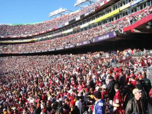
Football is the most popular sport in America, and everyone who follows it has their favorite squad. But, aside from your favorite team, have you ever noticed yourself being drawn to another team based solely on their team colors or logo? From top to bottom, the NFL is full of original, attractive logos. Here’s a brief look at some of the best.
1. Pittsburgh Steelers
There’s no arguing that some of the best logos in the NFL are the ones that haven’t changed since their conception, and the Steelers logo is one of those very logos. First introduced in 1962, the Steelers logo is the same as the American Iron and Steel Institute, and was used to show the importance of steel in the Pittsburgh economy. It features 3 diamonds – red, blue, and yellow – encased in a circle with the word “Steelers” next to it. Unlike any other team in the NFL, it is only on one side of the helmet – a true classic.
2. St. Louis Rams
The St. Louis Rams logo is another old-school design that hasn’t changed since Rams player and artist Fred Gehrke painted the famous curling ram’s horn on the team’s helmets in 1948. The only aspect of the logo that’s changed is its color scheme, which is now blue and gold. The horns are both symmetrical and eye-catching and without a doubt are the most recognized helmets in the NFL.
3. San Diego Chargers
Simplicity is the name of the game for the San Diego Chargers logo. Featuring a single curved lightning bolt, the logo, like the Rams and Steelers, has remained unchanged since its inclusion into the NFL in 1970. While it may not be the logo that strikes fear into the hearts of opponents, it definitely is a memorable logo, and one that will probably withstand the test of time.
4. Houston Texans
Whether or not you like the Texans or Texas, there’s no denying that their logo embodies the entire spirit of the state of Texas and its historic football heritage. It features the red, white and blue head of a Texas steer, adorned with a single star. It’s a truly iconic image in the spirit of the great state of Texas.
5. New England Patriots
While the New England Patriots logo has changed over time, the current emblem is perhaps its best to date. Featuring the face of a Revolutionary War soldier, the Patriots logo is interesting because it’s patriotic and has become synonymous with success. It’s only natural that people would be drawn to it. Well, drawn to it for their football, or for most ladies, Tom Brady.
While there are many other logos that I would offer honorable mention to, these are the five that transcend above all the others. However, there are many cities out there that don’t have an NFL franchise. If that’s the case, you could always buy tickets and cheer on other team sports. If you’re from Oregon, maybe venture out and buy Portland Timbers tickets. Although it’s not nearly as big as the NFL, Major League Soccer is the fastest growing sport in America. You won’t be disappointed.


